
Good article. The first two are classic and I’ve encountered them several times. The lesson is: always look at the scale.
How Graphs Can Fool You
May 18 2010
You can be easily tricked into believing things if you don’t read the actual data and just glance at the graphs. Below are some of the ways how graphs tend to fool you.
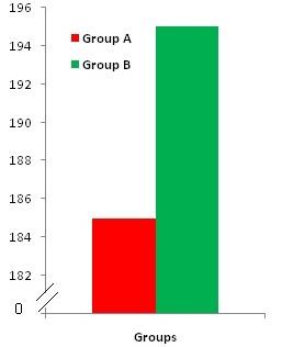
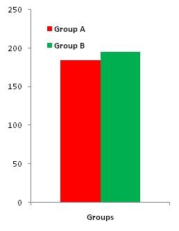
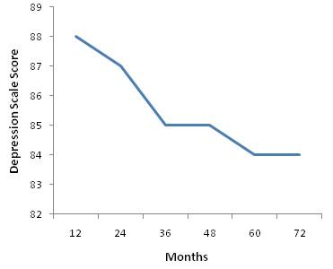
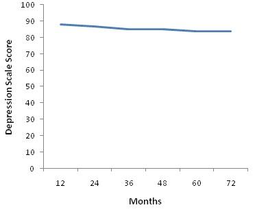
Distortion of Scale
Here the units of the graph are distorted to make the differences between groups to look much larger than what it is. The second graph shows the more accurate representation. The difference in strength in Group A is made to appear triple that of Group B though it is only a 10 lb difference.
The score above 70 represents clinical depression. The decline of depression scores over 72 months is only 3.5 scale points but is made to look significant by distorting the units. The second graph is shown in the correct scale.
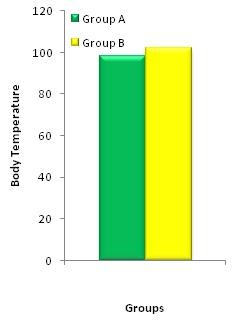
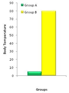
Distortion of Meaning
The graph shows the difference in tempertaure to be trivial though 98.6 is normal and 102 is significantly elevated. The second graph shows a meaningful representation considering it shows the percentage of people in each group who exceeds the normal temperature of 98.6.
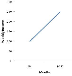
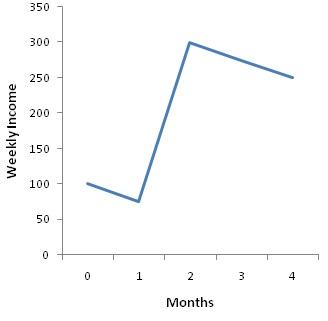
Linearity Distortions
In longitudinal studies, it is usually customary to connect the pre and post test values with a straight line which can distort the true picture.
The graphs shows the changes in weekly income. The first graph shows measure taken only at the start and end dates which misleadingly suggests a steady rise in income. The bottom graph provides the monthly data and the true picture.
Related Articles
Anoop | Wed May 19, 2010
Thanks Karky!
I remember how my professor talks about how when people turn in grants, they have units such a way to make the difference look bigger.
I have added a new Category called Research. I will add more stuff in. Not sure how many people would be interested though.
You see great examples of these distorted graphs in BBing magazines. They are supposed to add legitimacy to the product LOL.
Anoop | Mon May 24, 2010
Yep. It seems like in every protein jug it is mandatory to have a graph showing the effectiveness of the their product.
And I wrote the article because you can see it in every field, not just in bodybuilding.
